On my personal Social Media accounts, I asked for any burning questions about Design, Logos and Branding. So these are the things that normal people want to know, not people within the industry. The first one I’ll be answering is quite a simple one. But I promise I’ll manage to overcomplicate it in my traditional style:
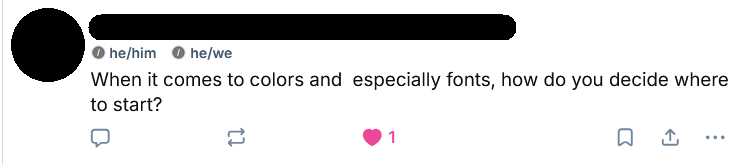
When it comes to colors and especially fonts, how do you decide where to start?
Which is a fantastic start, of course we should start with what I start with. And while this question specifically asks about Colors and Fonts, I want to talk more about my process in general. And here’s the secret: once I start actually designing the logo, I am leaps and bounds ahead of where it seems I am. I already basically know what I’m trying to make, and that’s all because of the pre-production that goes into a Logo Design job.
A fantastic logo design is born before you open Illustrator, and even before you touch your sketchbook. The way I make sure my logo is exactly what it needs to be is by making sure the brief is top notch. So the first thing I do with a client is sit down with them for an hour or two, with a cup of coffee, and I listen to them. I have this briefing questionnaire that talks through basically everything from their missions and values to their target audience, strengths and weaknesses and, of course, what they like and dislike about their current branding.
And more often than not, when I’m going through these questions with the client, they say things like “I’ve never had to think about this kind of thing before”, which mean that not only is this great for me and the design, it also is helping a small business owner consider where their business sits in the market. Win/win!
But as well as doing impromptu business coaching, the thing I’m doing the most during this questionnaire is LISTENING. I shut the fuck up, drink my coffee and write down any and everything the client talks about. They lead the direction, they tell me their problems and their goals, and I document. If anything, I ask for more detail, and that’s it. Let them give me all the information they can, about every asset of their business.
Then what I do is I go through the answers, to find around 5 keywords that really sum up the vibe of the answers given, then I start mind-mapping. I explode those 5 keywords into 10 related terms each, giving me now a wordcloud of 50 words, concepts and vibes that sum up where the client wants to position themselves and what kind of feeling they want to give off.
This means that when it finally comes to starting to think about design, I’m basically building a conceptual jigsaw puzzle, connecting a couple of these things in a way that makes sense. Now there’s a warning tag associated with this, and it’s something I’ve talked about before and will talk about again: simplicity. You need to make sure you’re not adding too many pieces to the puzzle you’re building. Instead of trying to implement every single one of your keywords, you want to end up with something that brings one or two of the more important or unique ones into focus. This way you end up with something memorable and unique, rather than something busy and cluttered.
Sorry, I got distracted there, we were talking about colors and fonts. Well, if you’ve followed the process so far, you now not only have a wordcloud of keywords but also a deep dive into your clients wants and needs. This questionnaire does talk about fonts, but it also discusses themes like Modern vs Traditional design, Cheap vs Expensive, Refined vs Rugged and so on. It really drills down into the themes, which makes it super easy to transition that into fonts.
Looking at making a traditional, refined logo? You probably want a Serif font. Going for a Modern, Technology startup? That’s Sans-serif country, baby!!
And it works the same with colors. You want to lean into the colour that evokes the feeling you need. So if we’re looking at something high-energy and fun, we’re probably going into the Reds and Yellow zone. But if we want gentle and calm, Whites and Pastel Greens might be the way to go. For something non-gendered we might want to look into Purples. And then we can tweak the colour temperature to be a bit warmer if we want to evoke comfort or nostalgia, and cooler if we want modernity, sleekness and the like. Just don’t go too far. Less is more.
This is, of course, influenced by cultural context as well. We wouldn’t want to use white in the east, where it represents death rather than calm and purity.
To cut a long story short, and this can apply to basically any kind of commissioned artwork, you can’t start work until you know what you’re working towards. And that means asking questions and listening to the answers. You’re designing for them and their needs, so you need to know who they are and what they need.
Get your map out, plan your route, put your shoes on and only then start walking.