That joke only works if we ignore the fact that here in the UK, I'm not talking about Lays at all. Since here we call them "Walkers", for reasons that date back to companies merging but not wanting to sacrifice brand recognition in either territory. So as far as I know, they're called Lays basically everywhere except here. Where they're Walkers.
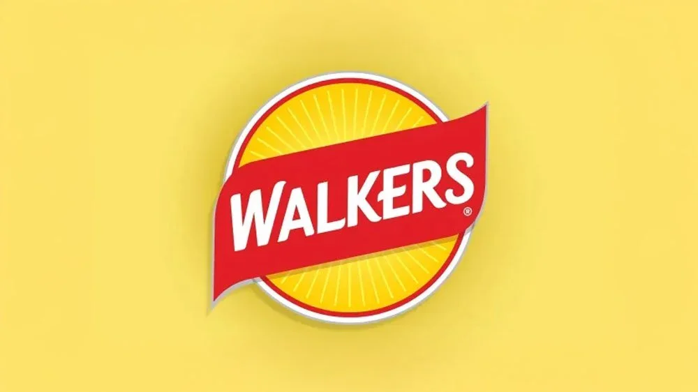
Either way, with all that bumf aside, they have unveiled a new logo! And they're celebrating this as the first major shift in the company's branding in years. Let's take a look:
Credit: PepsiCo.
Yeah. It's.... I'm not gonna lie it's a little less of a major shift than I was expecting. All the constituent parts are still there, the red ribbon, the wordmark, the gold circle. The key difference is that the circle is now more clearly a sun than a crisp. But generally, I like it! It's got that Retro-throwback style that a lot of consumable companies are utilising these days* to great effect. It's bright, it's eye-catching, it's got that slight uplift that gives positive associations to the viewer, and I really like the colour palette! The bright gold pops, the subtle gradient is used to great effect and it's single-colour variant brings those sun-rays to focus nicely.
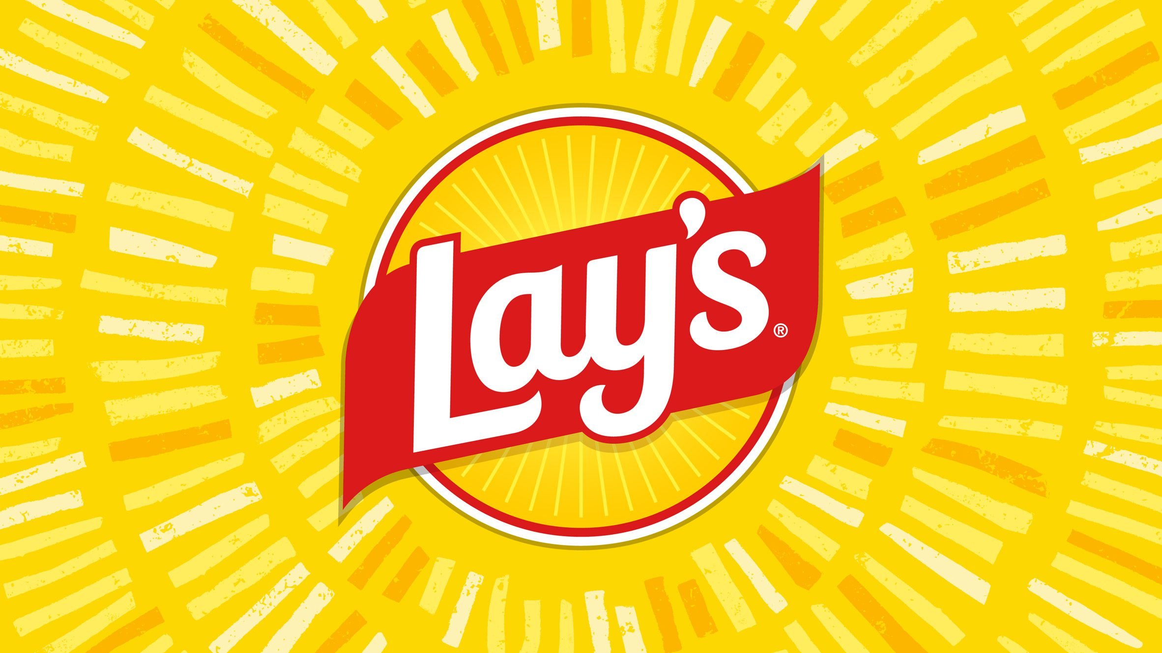
And I gotta hand it to the America this time, because I think the Lay's version of this logo (which they've had since October!) is slightly better.I think having the text pop out of the red ribbon just a little adds a lot my dynamism to the logo in a way that the Walkers one just doesn't have. It's only a minor thing, but I do think it adds to the logo in a big way.
It's not perfect though. Going back to the Walkers variant - the one I'm going to be looking at on a near-daily basis. In a write up by LMRT Design, they pointed out that the spacing in the Wordmark is a little wonky, the W and the A are a little far apart from one another. And, to be fair, you could drive a bus between those two letters, and I'm surprised they got away with that, especially how tight the spacing is on other letters, such as the K, E and R. I'll also be interested to see how this logo scales down to, say, a Favicon on a website or App Icon. There's a lot going on with Gradients, Shadows, thin Lines and the like, and a lot of that will be muddied when it's shrunk down. I hope they have some sort of simplified version for that use-case. But with the press releases bringing a lot of attention to them, calling them "Lay's Rays", saying they represent "the potato's journey from farm to chip". So I don't see them going anywhere any time soon.
What's also curious is that in the big press release about this, PepsiCo stated that "42% of people who enjoy Lay’s don’t realize they’re made with real, farm-grown potatoes". Which is a baffling statistic, but it might be raising this question: Why didn't they put a potato on the logo then? And that's where we come to our teachable moment: This rebrand is more than just a new logo.
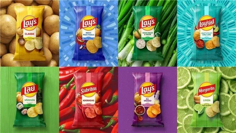
Their entire positioning and marketing tactic has changed, with a newfound emphasis on the natural. Colour palettes inspired by their ingredients ("pickle green, hickory brown, savory red"), potatoes on the packaging, farms and natural woods on the marketing materials. They're going all in on promoting these crisps ad made from real, natural ingredients, which coincides with the American arm of Lay's eschewing Artificial Colouring - something Walkers had done back in 2002.
But my point here is that if you want to change your message, change your positioning and change the way that the public thinks about you: it's gonna take more than just a logo. You need a top-to-bottom refresh, built strategically and expertly by someone with that complete rebrand mindset. You can't just slap a new label on it and expect everything to fall in line.
If you're in the market for a big refresh, if 42% of your customers grossly misunderstand YOUR product or service, then you're in luck: I am currently running a January Sale! If you grab the Core Package off my website, and pair it with an Annual Retainer Package, I will upgrade you to the the CHARGED package for completely free! That's a £500 saving ON TOP of the £1000 saving you get from the Annual Plan! Banging, right?
Anyway, that's my cheap plug out the way. I fancy a bag of crisps, now.
*Note to self, write up something on that one day. Because that's a big, juicy topic