Right, this is my last one of the year. I shan’t be bugging you through the Christmas season, not to worry. You can enjoy all the mince pies and twiglets you want and not even think about their logos until January. Hey, maybe I’ll write a thing in January about all the logos and brands we only ever see around Christmas…hold that thought. That might be back. But that’s for then. As it stands, this isn’t that article, this is this article. And this article is your end-of-year look back at some of the big branding moves that big companies have made this year. But then we’re going to dive a little deeper and try to extract some sort of lesson from each one. Because every day is a school day, even at Christmas!
Gov.UK and the Mythical £500,000 Dot
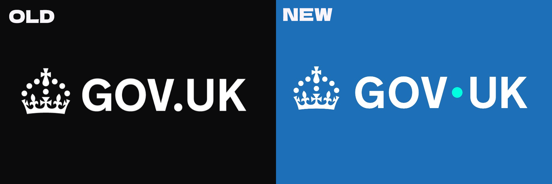
You may have seen the headlines if you live in the UK: “The New Labour Government is wasting Half a Mill of taxpayer money to move a dot on the Government Website!” And other such associated bollocks. And, well, for various reasons this assessment very much misses the point. Many points, actually, all missed.
The simplest one to explain being the reason this is being used as a propaganda tool: The Current Labour Government has been blamed for this “Vanity Rebrand”, when in actuality these contracts were secured back in 2024, during Rishi Sunak’s Conservative Government. I’m no fan of the current Labour Government, but if you’re gonna get mad at them, get mad at the things they’re actually doing, you know?
But also: it wasn’t a £500,000 Dot Move. Heck, it wasn’t even a £500,000 logo refresh. It was a full, internal and external brand refresh, complete with:
Improved accessibility for all government resources
Rules for coherent real-world application of all the Gov UK branding
A simplified Colour System, ensuring print and digital resources look the same
Improved flexibility for long department names within the brand
A full, in-depth, publicly accessible brand guidelines
So it’s like… It’s a lot of stuff. Way more than just a dot moving.
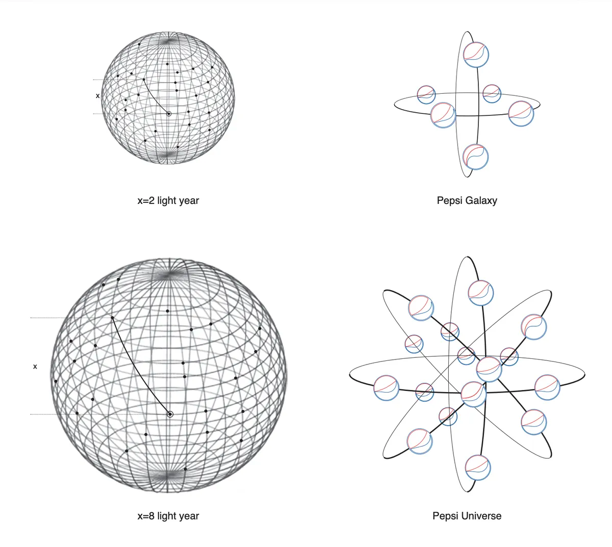
I do agree it’s way overpriced, though. And looking through the documentation, the brand guidelines, it’s a whole lot of waffle reminiscent of the 2008 “Pepsi Gravitational Field” document, you know the one. This one. It’s amazing what they’ll put into these documents to try and justify their work.
The Lesson: A brand is more than the visible assets.
A brand is an entire communication infrastructure, a visual identity, a personality, a voice, a foundation for clear messaging with your audience, no matter who that may be. It’s a system, a series of interlinking systems that makes the life of you and your end users way easier in the long run. It may not - it should not - cost you half a billion, but it’s worth spending more than you may expect for something that gets the job done right. A brand refresh doesn’t have to be big or flashy. It just needs to work. It needs to be scalable, accessible, flexible, and most importantly: trustworthy.
Cracker Barrel and the Legend of the Woke Logo
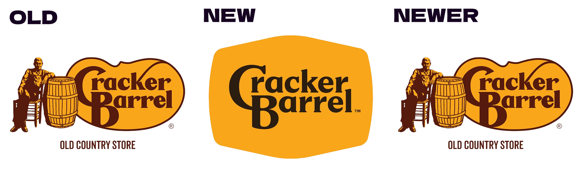
This one was unavoidable. Even for me, a person who has never been inside a Cracker Barrel. Heck, I’ve never even SEEN a Cracker Barrel. But of course there was weeks and weeks of discourse about this. They took the Barrel out of the logo! They took the Cracker out of the logo! They’re ruining an American icon! Some even accused this rebrand of being…Woke? Which, well, if that word hadn’t been overused to the point of meaninglessness before, it definitely has now. What is “Woke” about a plain, uninspired logo? I would, in fact, suggest that the OLD logo is the more “Woke” one, since the idea of stripping everything of personality and leaving just the recognisable name as an avenue to generate more money without decoration or any other extra stuff is a right-wing, capitalist mindset. Look at how McDonalds and Pizza Hut have both stopped using their iconic decoration and architecture, simply because it is cheaper that way, and it means more money for the shareholders.
That ain’t Woke. We lefties don’t care much for shareholders. And for the record, I hated this new logo. The bland, boring, lack of personality, the weird shape that is definitely supposed to look like a Barrel, but doesn’t. It’s just a failure on every front. User u/Awartinger on reddit did the definitive “this is what it should have been” redesign, to which we all went “yeah, no, that’s it. They nailed it.”
The Lesson: Prepare for reactions you did not expect.
Now I’m not expecting any of you to get a logo redesign as catastrophic as this one. You have more refined taste than that. But even if you get the best damn rebrand in the world - one perhaps led by a red-haired designer with a penchant for piratical fashion - you’ll have backlash. People don’t like change, even change for the better. Now, you might not get Fox News or the President of the United States on your case about changing it back, but there will be people that will dislike it. But prepare for backlash, prepare for how to handle it, do not get mad. Do not get indignant. But also, do not hide the backlash. Just let it happen, continue your rebrand and if it gets so loud, maybe make a statement.
But prepare for a little bit of unrest. Don’t let it get to you, don’t let it discourage you.
And that’s that! But, since people might be curious, I do have a few more quickfire takes about rebrands this year:
I really like the new Mountain Dew logo, I think the return to retro designs in the food world is really exciting and might lead to more colorful, exciting brands in other fields, too
Jaguar’s rebrand is fine. They’re trying something new, trying to capture a new audience. People just don’t like change. And older models will still have the old badge, it’s fine.
Eventbrite’s new E is full of action, and way better than the old logomark. But it is just the Envato Elements logo upside down.
Dunkin’ Donuts changing to just Dunkin’ is a good move. It’s what everyone called it anyway and it allows them to expand beyond being known for Donuts
HBO Max née Max née HBO Max is ridiculous, but at least they’re back to a name that actually means something now.
That’s all from me, until after Christmas! Happy holidays, whatever it is you celebrate this year. Thank you for reading my rambles for the past however long it is you’ve been reading, and I hope I’ve given you something to think about, a lesson or two or something to think about regarding your own brand, be it a personal brand, a hobby or your business.
And if you want to kick off January with a fresh chapter, a fresh start, a new look, a new vibe or however you want to euphemise “you want to give me money to make some branding for you”, then you can get in touch with me by just emailing me: eden@killawattstudios.com
Cheers!