Creating the perfect brand through imperfection
Janet is an absolute powerhouse of a woman. She was the first in her family to get a degree, worked in packaging design, got a PhD in sustainable design, co-founded charities, sold artwork. And then everything changed in 2018 when she was diagnosed with Parkinson’s.
But Janet didn’t let that slow her down, and she co-founded the Parky Players, a theatre troupe for people with Parkinson’s to express themselves, find new friends and stay active. Letting their voices be heard, letting their stories be told.
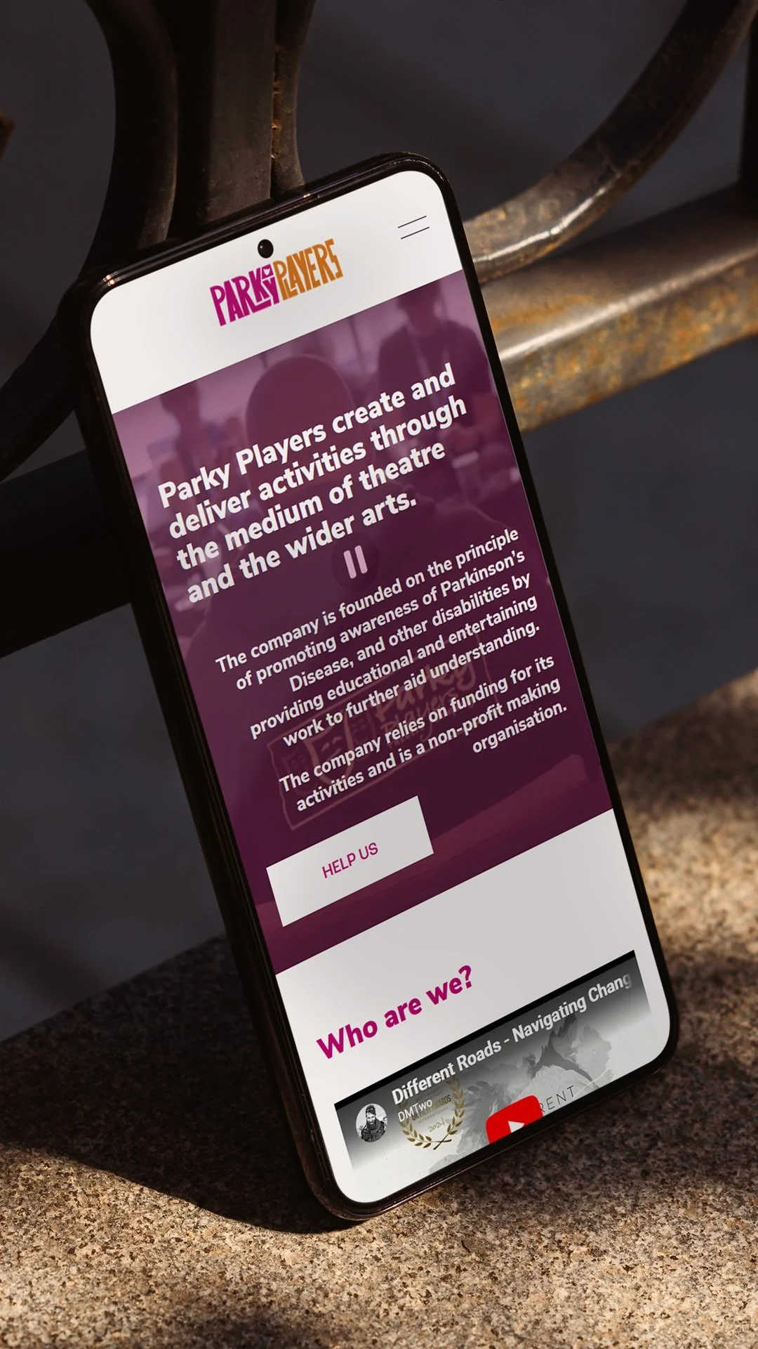
And like all great things, Parky Players grew. It grew beyond just being a theatre company. It’s publishing books, doing poetry slams, documentary films. So their old logo, based on the Tragedy & Comedy masks, wouldn’t cut it anymore. They came to me with a completely open mind, so after a big chat with Janet, a poke through their online presence and an honestly quite shameful first draft, we decided that humans need to be the centre of the brand. After all, Parky Players is supposed to celebrate the lives and voices of people with Parkinson’s. The messy, imperfect and unique lives. So let’s hone in on that.
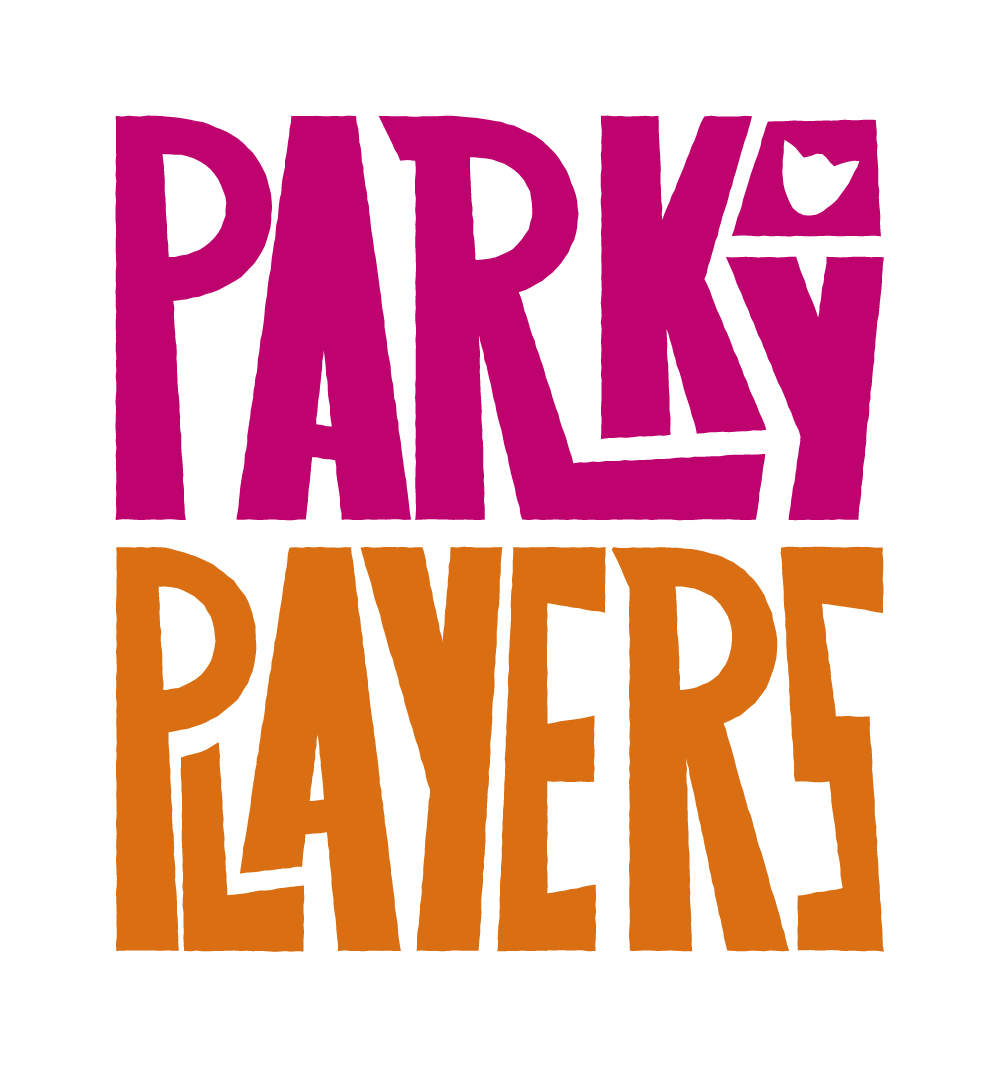
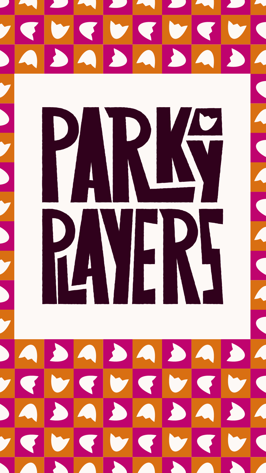
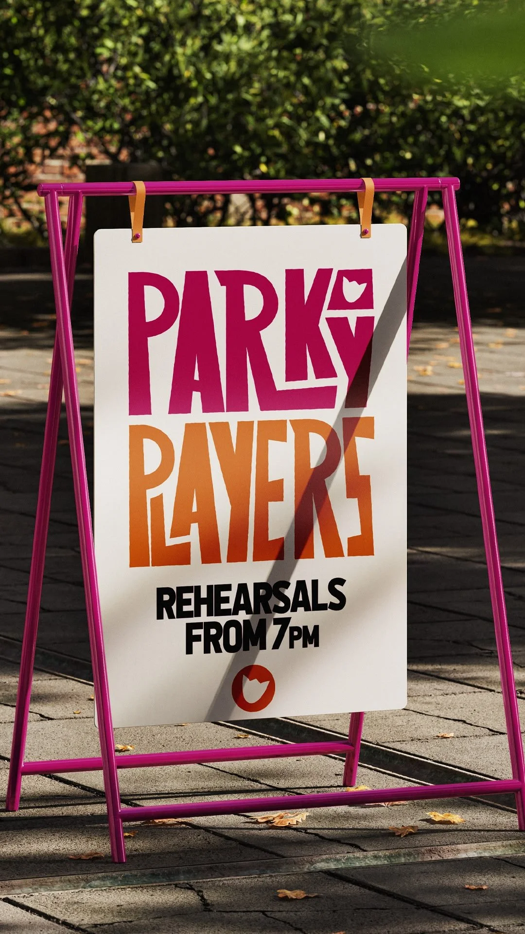
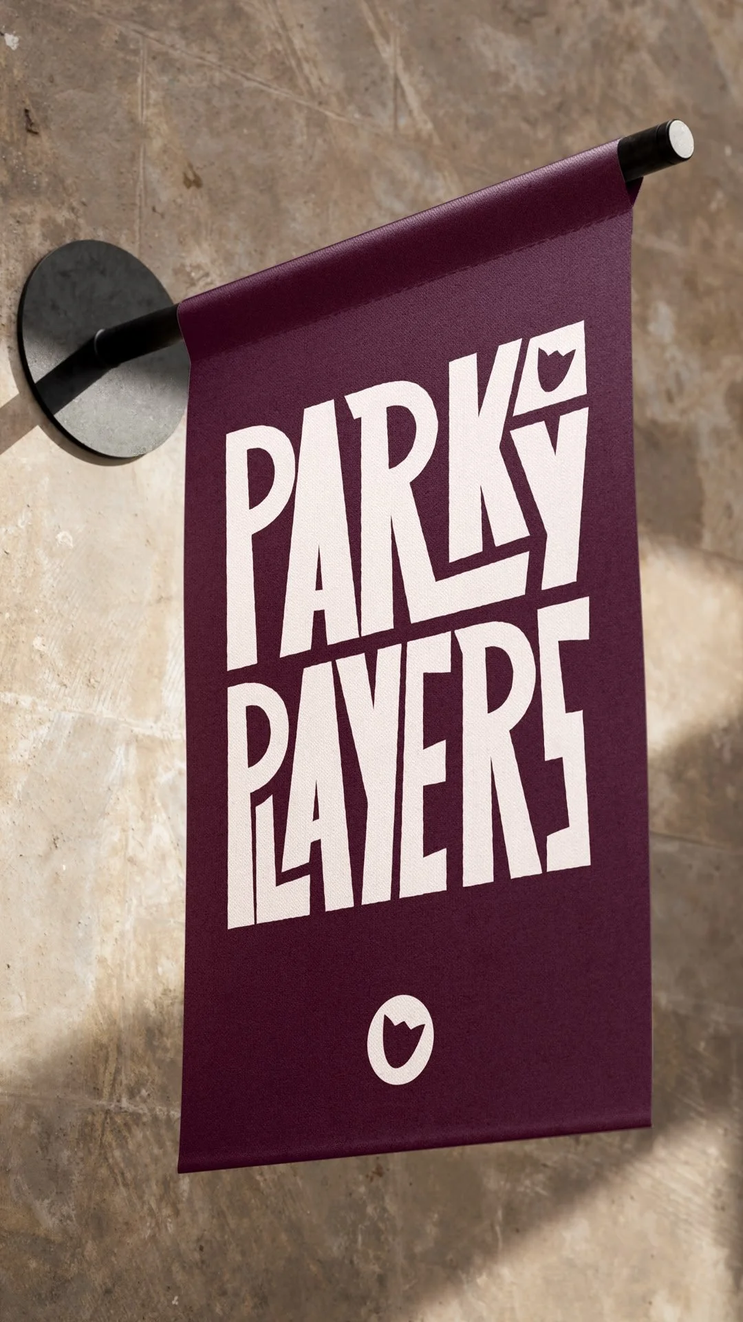
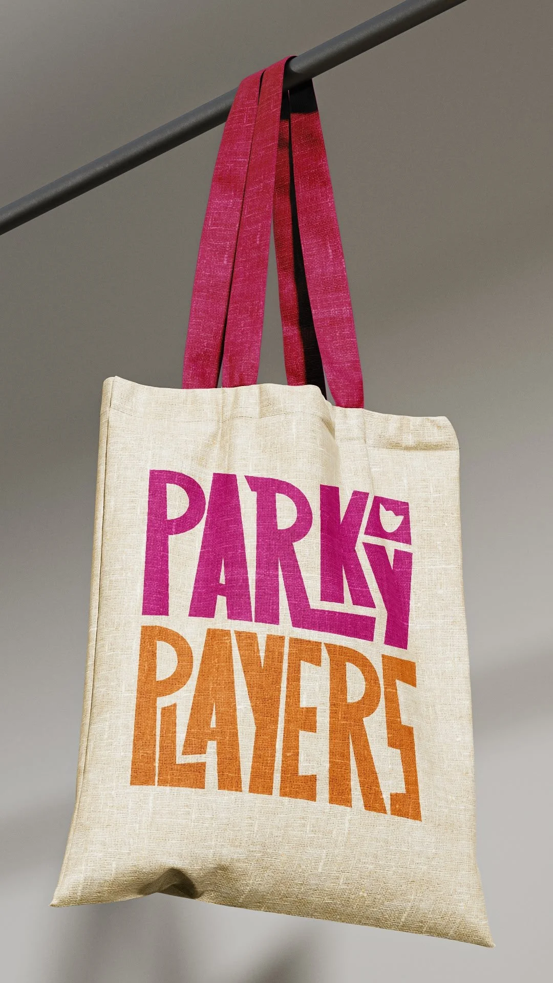
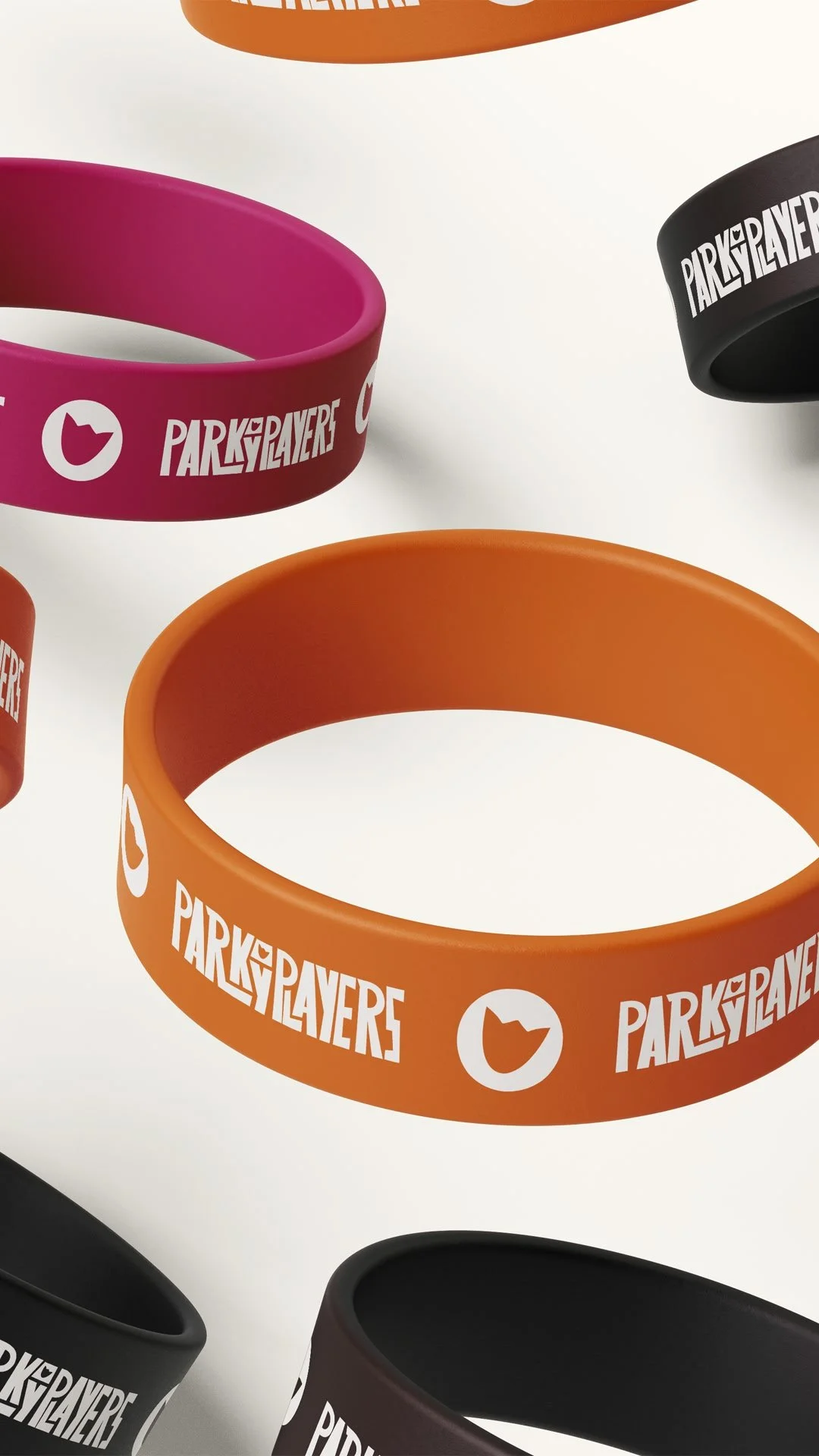
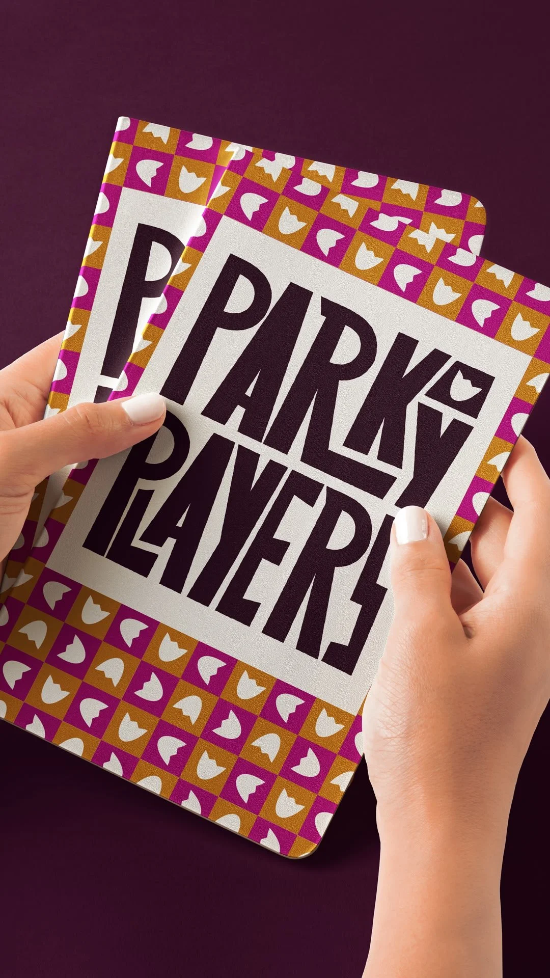
I created this bespoke wordmark, and at first glance from a designer’s eye, you might recoil in horror. The spacing isn’t perfect. The letters aren’t uniform. Some of the lines may look at a tad too thin. But the imperfections in this logo are what make it special. These letters lean on each other, hold each other up and through their combined efforts, their unique and slightly wonky shapes form the organisation, perfectly reflecting the Players themselves.
So to answer the question from the top, a logo doesn’t have to follow all the rules and be “perfect”, to be perfect for the client.
Simple, elegant & fun!