Missing the Monstrously Open Goal
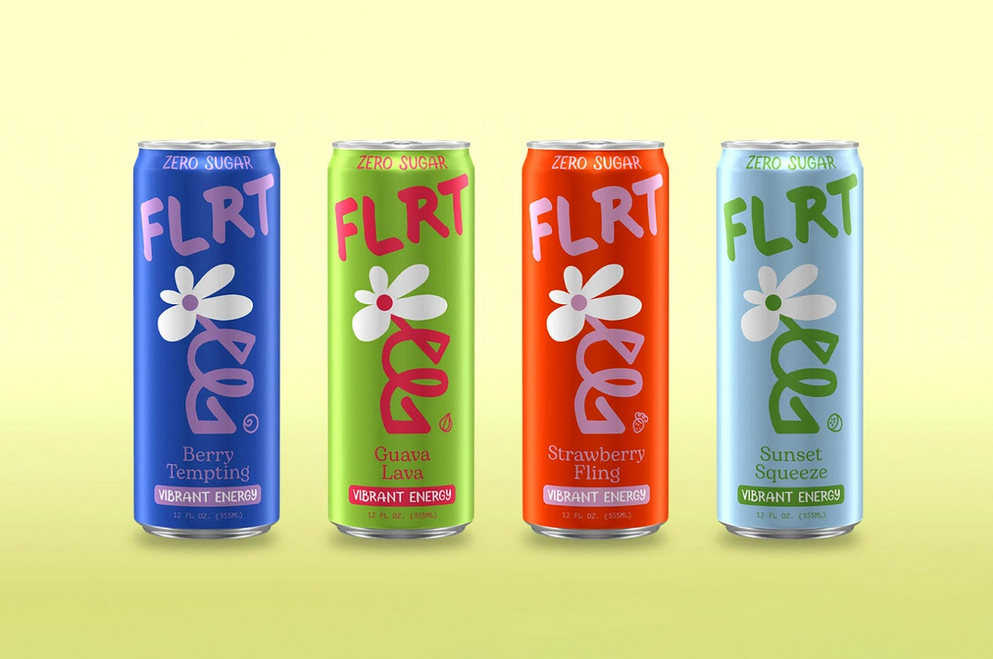
On Monday, Monster Energy announced a new product line, aimed at Women, called FLRT. Dainty little 330ml cans, pastel colors and a design language that looks more like Kombucha or all-natural skincare than the look we’re used to associating with Monster Energy, or Energy Drinks as a whole. Allegedly, of course. A website has been built and it has a copyright for Monster Energy’s parent company in the footer. So like, they haven’t officially announced it yet but all the pieces are there. We’ve just unwrapped our Christmas presents a little early.
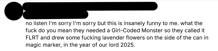
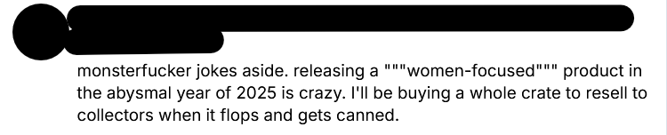
And what we’ve found is hardly eliciting the Nintendo 64 Kid’s response. (Is that too old a reference these days? You know? “NINTENDO SIXTY-FOOOOOOUR!” No? Okay, forget it). Basically, the reception online is a resounding “but why?”. I mean, let’s have a look at some of the responses on social media.
The tl;dr? Women are not happy. They think this is a very funny, albeit very disrespectful, misstep. And the reaction from folks of other genders are much the same. People are ranging from bemused to outraged, with not a single person going “Finally! An energy drink for me!”


So why did they do this? And why is it a misstep? Let’s have a chat.
I would usually open these kinds of things with “I can see why they did it, here’s their reasoning”, but honestly this time I am drawing a blank. It is 2025, are we really still doing “[Product] for women: Now in pink!”?! Like, didn’t we leave this shit in the past 20 years ago? Women are allowed to have a can of monster if they need an energy boost. Heck, most of the people I know who drink Monster ARE WOMEN! They’re not struggling to hold the bigger can or put off by the dark colours and sharp edges on the logo. In fact, looking at successful energy drink brands, I would posit that it’s the strong, bold colours and big, well, energy the drink and the brand put out that draw people into choosing it and trusting it.
But of course, they are not aiming for the average “Energy Drink” market with this, are they? They’re aiming for…
The Alani Nu-phant in the Room
Now I was flailing around trying to find some reason behind this bonkers bit of branding, and someone on bsky mentioned “Alani Nu”, which at first I had no idea what to think of. Then I googled it, and everything fell into place. Monster Energy - or rather Energy Beverages LLC - are trying to eat some of the market that Alani Nu has successfully carved out for themselves. And they are missing the mark massively.
For those, like me, who are unaware, Alani Nu is a wellness and fitness drinks company - selling things like powdered energy drinks, protein snacks, pre-workout and yes, energy drinks. But they do it in a softer colour palette than the usual gym-bro selection, with quotes on the website like:
The bottom line is that our entire mission is to help you succeed. Whether you want to hit your last rep, hold your next handstand, or balance your hormones, we want to be beside you. That’s why we’ve worked so hard to create a company you can communicate with and to produce wellness and fitness products you can trust.
It’s clear that FLRT energy is trying to copy this look, just from the look of the can designs using the pastels and the website design clearly being aimed at women. However where Alani Nu is subtle about it, treating women as just people who need energy too, FLRT is a little more on the nose with it, offering no subtlety and even feeling a little…demeaning?
FLRT was born from a simple idea: energy should be as vibrant, fearless, and fun as the women who drink it. Better-for-you ingredients, with zero-sugar, no crashes, and no compromises.
It feels as if it is talking down to women, infantilising them by finally realising that GASP! Women want energy drinks, too! Well we had better give them one, but we’ll hastily sketch a flower out of Sharpie Markers on it. Women like flowers, right?!
I mean just look at the comparison between the two can designs. One is a vibrant, colourful and dynamic design that, yes, is built to appeal to women but also just looks nice and is attractively designed. The other… looks like a parody of the first can, to appear in a cartoon like The Simpsons. It’s just low-effort, and it shows disrespect for their target audience.
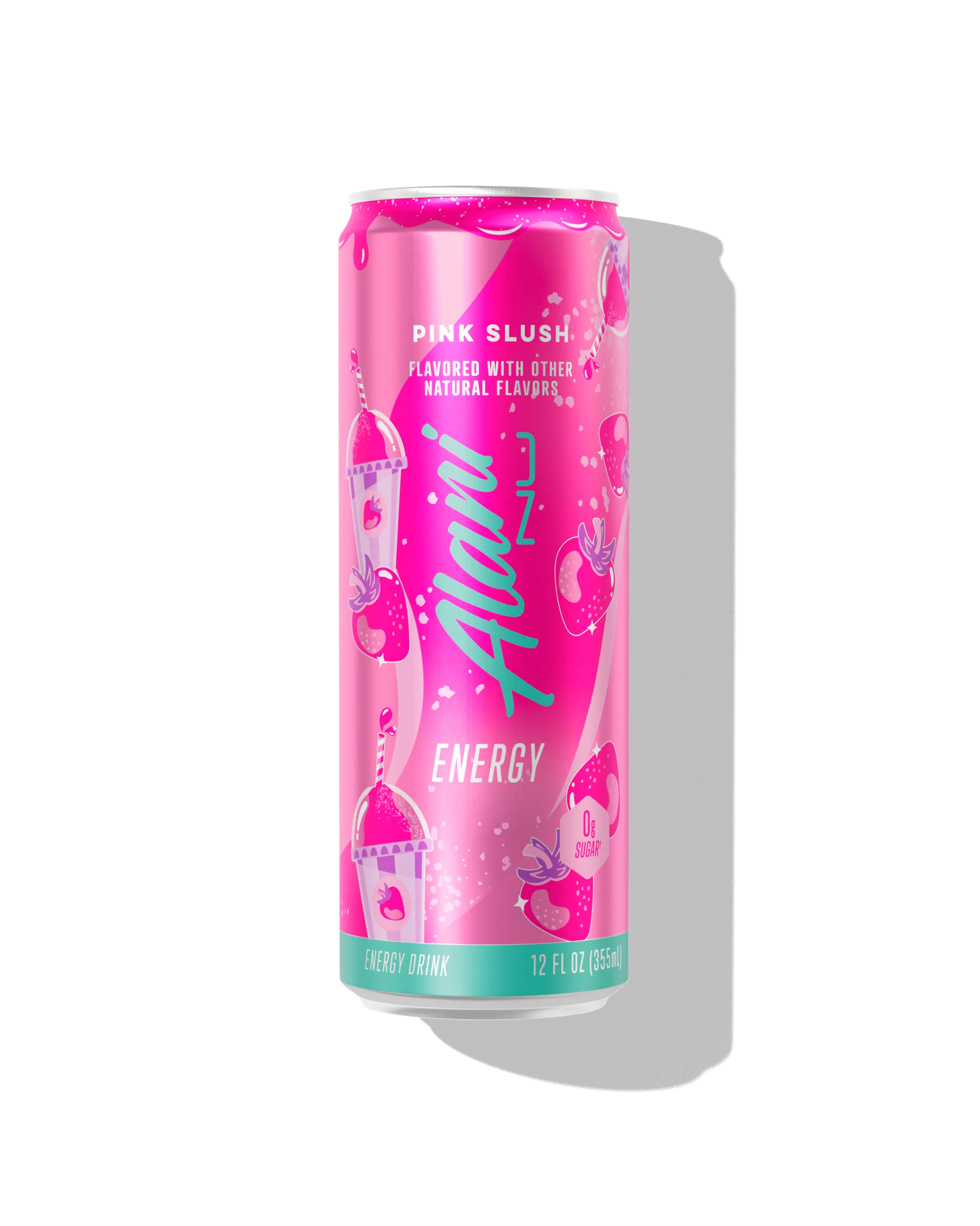
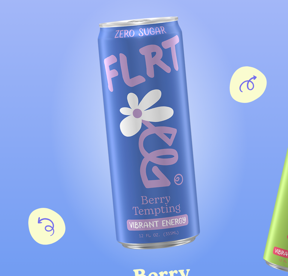
Even looking at these two cans, even though one is BRIGHT PINK, it’s not the one that’s blatantly trying to appeal to women. The Alani Nu designs are gorgeous, layered, artistic and all have a cohesive design language that is reminiscent of Arizona Ice Tea and Synthwave design language. Whereas the FLRT cans, well. It’s a flower, innit.
The tl;dr on this is: come on now. It’s two thousand twenty five. Do we really need to be doing “[PRODUCT]: NOW FOR WOMEN!” where we paint it pink or pastels and chuck a flower onto it? Nah. Come on, we’re better than that. This is all, of course, emblematic of a society that still treats males at the default and women as an aberration from that. But that’s getting too big for a weekly newsletter about a crappy energy drink. Maybe another time.