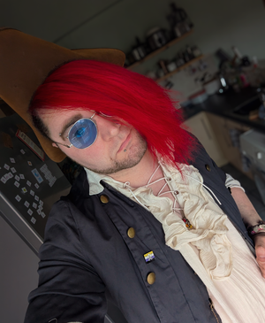
So, things have changed around here since we last spoke. Like, a whole lot has changed. All my profile pictures, names, website. Colors even. Experts are calling it a “Rebrand”. And I wanted to take this week to just sort of chat about the things that led me to doing this. Why I left the old branding, why I chose what I chose, and what it means for the future of The Ede- I mean for the future of KillaWatt Studios. That’s gonna take some getting used to, but boy does it feel good.
So! I used to be The Eden MW Design Studio. That was the name I operated under since about 2020. I don’t remember the exact date, but according to my Hover account I registered the domain in early 2021, so that feels about right. And it was, simply enough, my name, with Design Studio slapped on the end. Because I was trying to sound professional, but still personal. I wanted to just be me, but still look like I was being a business, being proper. And the logo was, well, I was enamoured with the idea of Ambigrams at the time. I still am, in fact. I have one tattoo’ed on my arm, see?
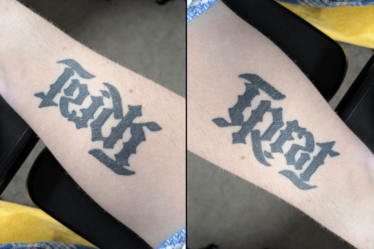
Trick or Treat?
So I took my surname, Maskill-Watts, and made a fun little ambigram out of the M-W. It was simple, it was cute, it did the job. At the time, I was really happy with it. It gave that lighthearted, casual and fun vibe I was trying to put across. The colours were taken from the Non-Binary flag, a colour scheme I still use in the new branding and a colour scheme I hold near and dear. This truly was a brand built for me, built around aspects of my character and personality.
But…let’s be honest it never really hit the way I wanted it to. It was always a compromise. A make-do. And when the business was flourishing I was too busy working on everyone else’s look and didn’t spare a thought for mine. Because it’s doing its job, ain’t it?
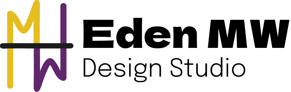
See that! I fell right into the trap I tell others not to fall into! I did the exact thing I tell everyone not to fall into! Your logo, your branding, should not be something that you just deal with because it gets the job done! You should LOVE your logo! You should be PROUD of your logo! If you wouldn’t be happy wearing it on a shirt in public, you need a new one. And that old logo? Never would have worn it out. It’s just simply not fit for purpose. Look at it! Thin, noodly lines that disappear when it shrinks, a vaguely uneven and weirdly weighted frame that doesn’t have a firm baseline and it’s just generally a bit weak.
Long story short: If I were looking for a designer, I wouldn’t hire me.
Smash cut to Liverpool Central Station, underground waiting for the Northern line. My partner, our friends and I were waiting for a train home after doing an escape room, something we do a lot, and oftentimes set new records in. To put it short: we smash ‘em. And we smashed it this time. My partner and I’s team name: Team KillaWatt. Because it’s what happens when you take my surname “Maskill” and combine it with his surname “Watts”. And while we’re waiting, I joke that we should have changed our surname to Killawatt when we got married, instead of Double Barrelling them. Because it would be infinitely cooler. He was rather unimpressed, as he usually is with this particular brand of nonsense I am prone to engaging in. So I say something along the lines of “But we could be the Killawatt family! Our house would be the Killawatt house! I could name my studios Killawatt Studios! How cool is that!” To which he shrugs and goes “You can just do that anyway, you know?” And we move on with our lives.
Except I don’t. That lingers on my mind for months. I could just do that. I do have that power. But do I have the balls?
Well, I didn’t. Honestly, for the bulk of this year I was a mess. No clients, no drive, no passion, and no confidence. Something had to change. And then, I got a call from Chris Trickett at Community CVS. He wanted to offer me a place on this Business Skills bootcamp, funded by the local council. Said it would build business fundamentals and other skills that honestly, I really needed. See, I know a lot about actually designing graphics. I know what makes a banging brand. But I do not know how to run a business. Or get a sales funnel. Or any of that other wank.
So here we are, 8 weeks later and through Community CVS and this bootcamp I have the confidence to relaunch myself, the confidence to put that killer name into action. The confidence to become KillaWatt Studios. And mate, I could not be prouder of what I’ve put together.
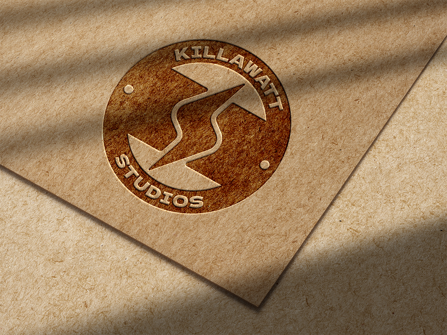
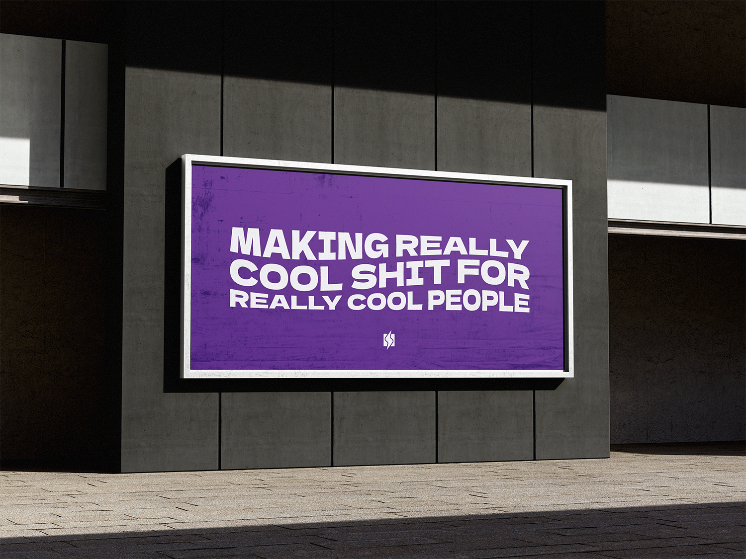
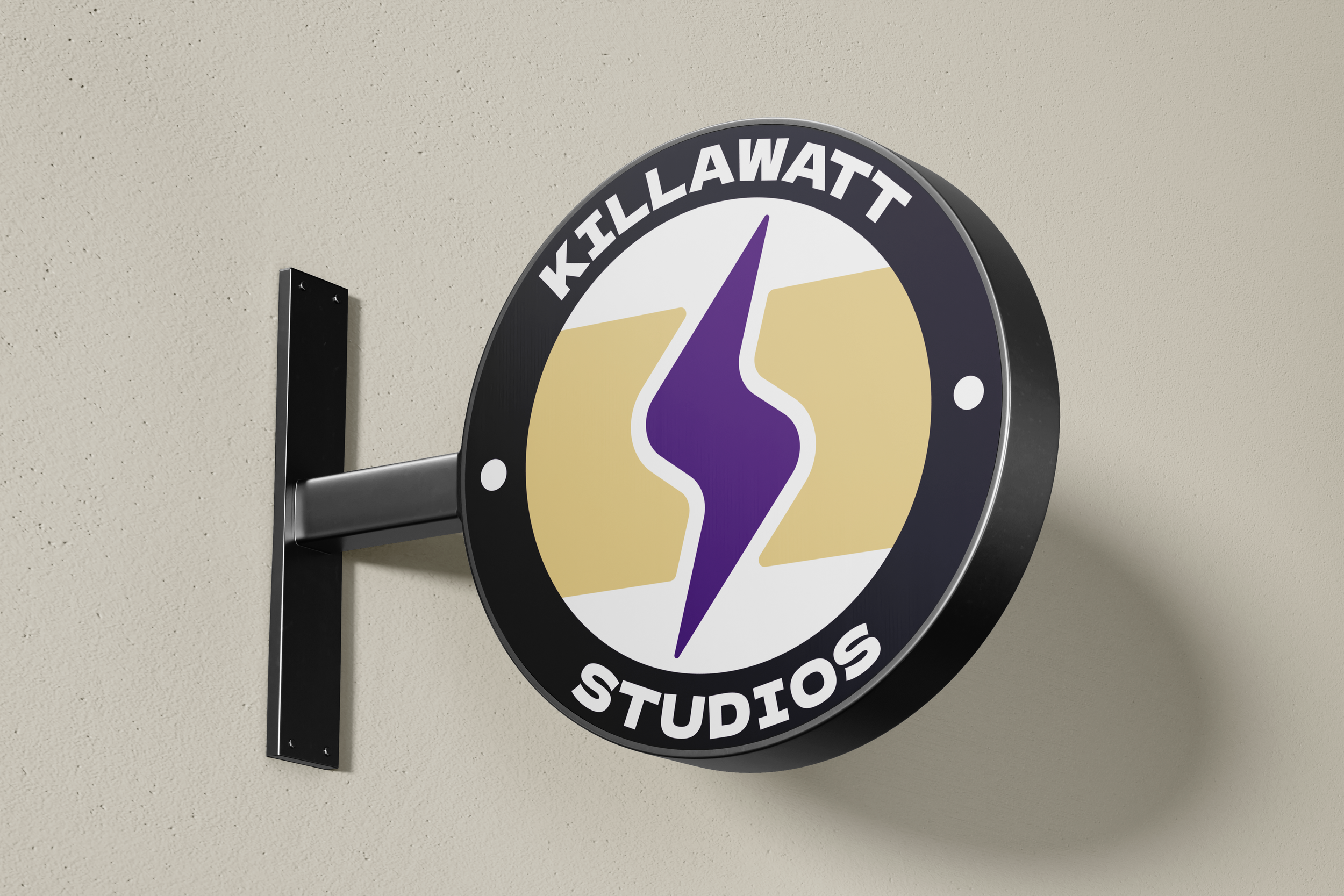
So the new look uses this rounded Lightning Bolt shape, of course harkening back to the name “KillaWatt”, but also representing the jolt of energy that this brings not only to me and my new business, but what I do for clients as well. It’s a spark of life, a bolt of enthusiasm and confidence. Those two shapes flanking are coming together, representing connection and communication. Those are two main parts of how I operate, and the outcomes of what I make for my clients. When I showed this to my friends, one of them remarked on how it sort of reminded them of the Mega Evolution symbol from Pokemon. And I kinda dig that. Because this is my evolution.
This is me going mega.
My three pillars: Energy, Communication, Collaboration.
My mission: Making really cool shit for really cool people.