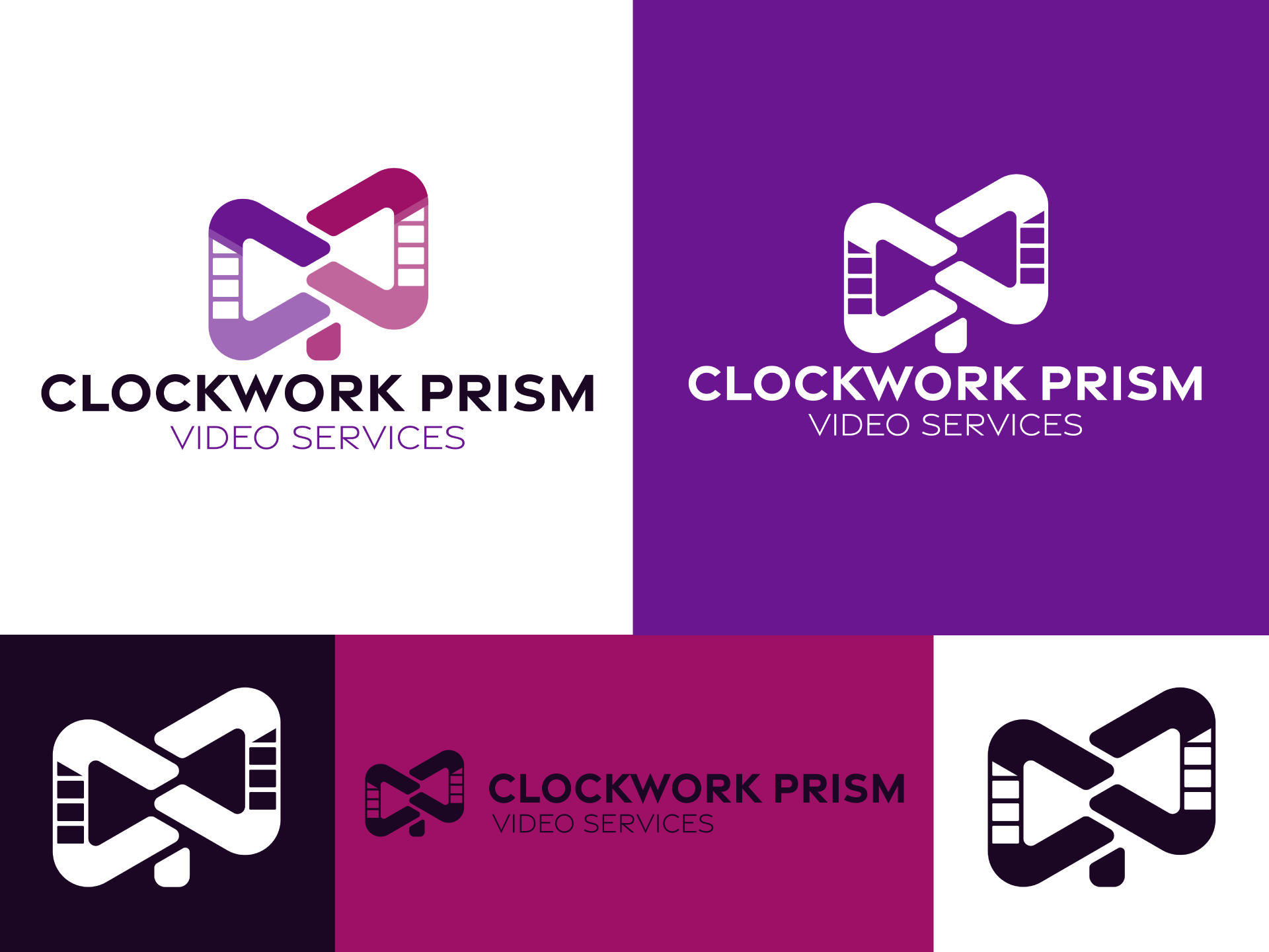
Updating a brand to reflect the cutting edge tech behind it.
Clockwork Prism had an outdated logo that did not align with their cutting edge technology and knowledge base. They struggled with brand recognition and were having difficulty reaching their target market. We had to design a modern logo that reflects Clockwork Prism’s core values of collaboration and communication, while ensuring it appeals to an upmarket, corporate and charity demographic. The overall goal was to increase brand recognition and customer engagement.
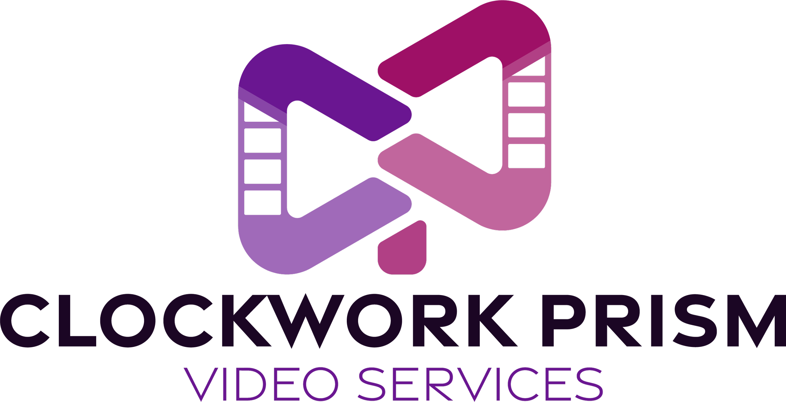
A monogram, with a bit more.
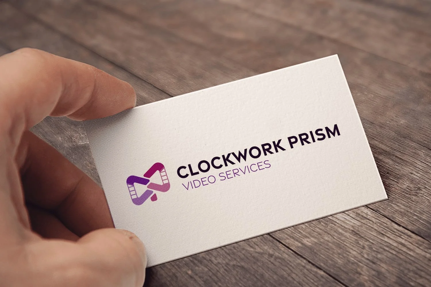
The final logo is a stylised CWP monogram, that also combines aspects of collaboration and videos being edited together. The color palette is a mix of blues and purples, to stand out in the usual Red colouring of video and evoking an upmarket feel. The typography was chosen to be simple yet bold and modern. Since the redesign, Clockwork Prism has seen a marked increase in enquiries from clients that closer align with their values. The new branding has helped them stand out in a competitive market, boosting how prospects and clients perceive the quality of their product.