Ax, the Drag King in charge of Monarchy Madness, had a relatively simple problem: They're new. This was the first time they were running a drag night in a town with a very active drag scene, so they needed to come out of the gate looking serious, like they knew what they were doing.
They also wanted to emphasise that this was NOT a Drag KING or QUEEN event, and that every flavour of Drag would get equal footing here. So no blues, no pinks, nothing too gendered.
Loud, edgy and subversive. But still well-designed.

Regally Neutral.
We decided together on Purple and Gold, as both are gender neutral colours that also have an element of regality to them. I also had an early revelation that the two M's making the initials of the event could be used to represent either a Crown, or a Jesters Hat, or perhaps something between the two.
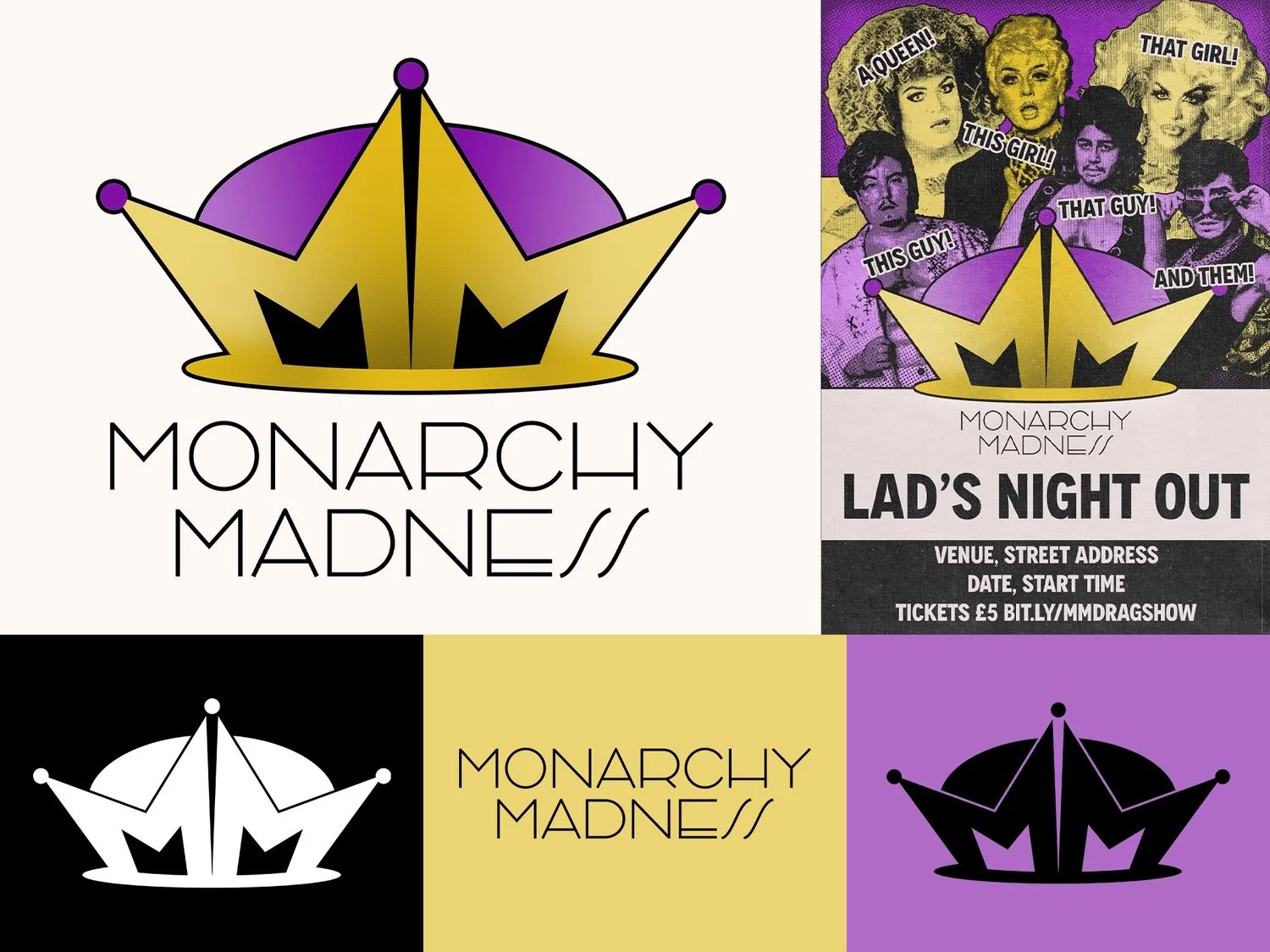
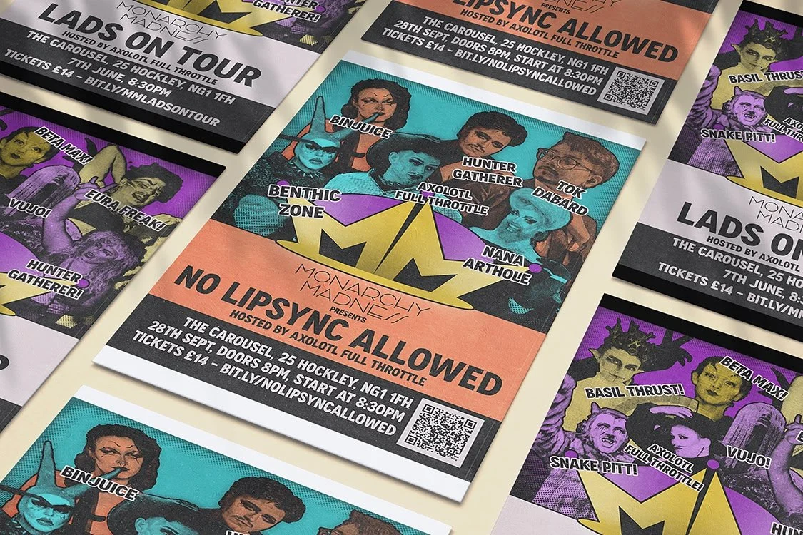
The final logo, along with the colour scheme we decided on and the accompanying poster. The poster was inspired by combining old school Queer Zines and High-End modern clothing and jewelry stores, using the minimalism of the latter to clearly display the information and the grungier, looser former to draw the eye to the performers.
Since the logo and poster reveal, every Monarchy Madness event has been a sell out, and Ax has been making each one bigger and better than the last, attracting bigger stars and bigger crowds