Last week, PepsiCo announced their new rebrand, and they describe it as a bold, new direction. I think it’s… well. Let’s talk about that. Let’s go through their press release, talk about where they were, where they are and what I think about this whole mess.
First, let’s look at where they were. The history of the logo. And thankfully, in their press release, they included this funky little timeline.
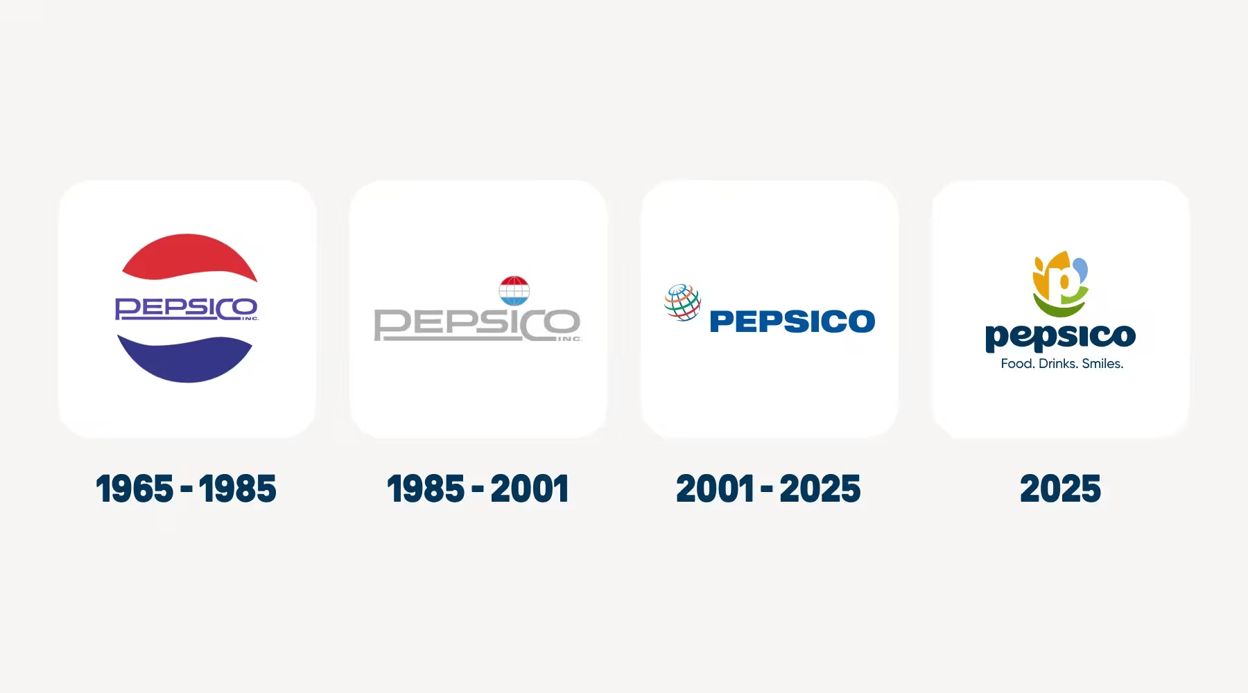
So basically, they evolved out of the Pepsi company, and have slowly spent their rebrands distancing themselves from that ever-recognisable globe shape. These logos have never been what I would describe as good, I think the previous logo is incredibly 90’s despite being from 2001, but they all followed a linear path of distancing themselves from the Pepsi iconography, while simultaneously setting themselves up as a global company with respect and authority. They wanted to be seen as a stalwart institution of a brand to be respected. Well, that is until this latest redesign.
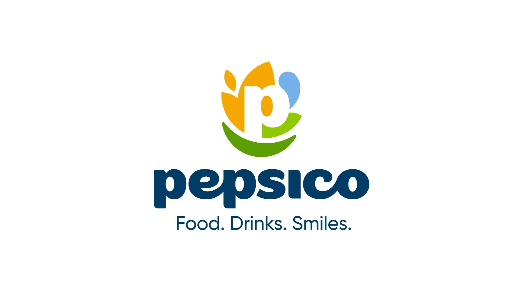
This latest logo is far softer, more gentle with pastels and lowercase and round edges. This is a common practice by companies that are trying to regain the respect of the public, positioning themselves as smol beans that are just little guys trying to give you the best they can, rather than massive mega-conglomerates who control the law of the land with billions spent in lobbying.
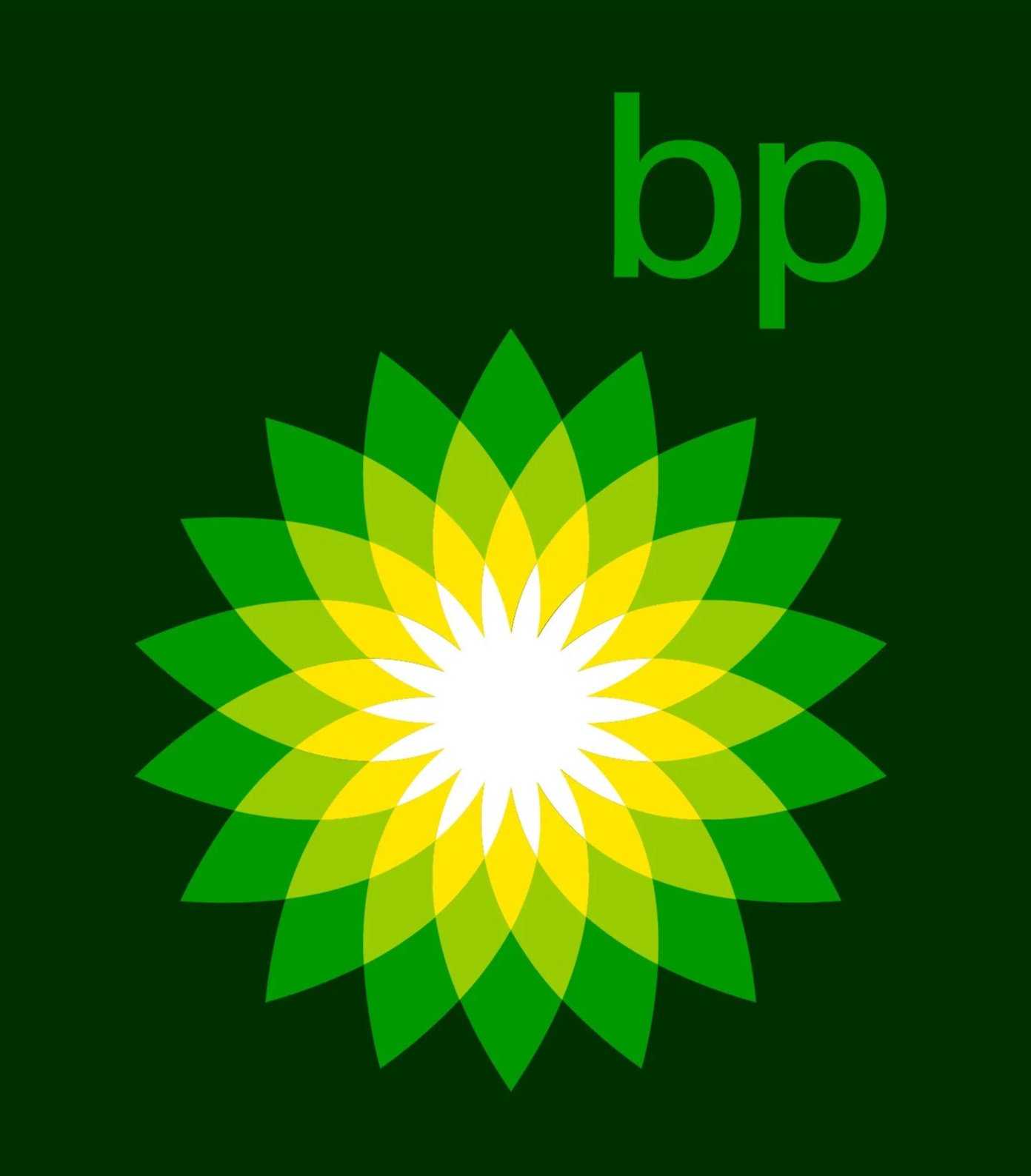
Case in point: BP. Look at the lowercase and bright colors! They’re trying to make you think they’re this bright-eyed and innocent company, not one responsible for climate change and oil spills.
But I got off track, let’s talk about Pepsico again. They would never have anything terrible to hide, and I’m not accusing them of trying to nicewash their image (yes I just made that term up). I guess I’ll just leave this list of the ten biggest PepsiCo lawsuits here and move on… https://lawyerinc.com/biggest-pepsi-lawsuits-in-company-history/
What did they say about this rebrand? Well…
“Our new look is more than just a logo — it's a symbol of transformation that captures the energy, optimism and ambition of PepsiCo in 2025 and beyond. From our commitment to consumer-centricity and innovation that comes to life through our brands, to our focus on simplification and modernization, to our efforts to become more sustainable and resilient with pep+, we’re moving with purpose and intention, building a modern, forward-thinking company. It’s also a significant opportunity to highlight the depth and diversity of our portfolio, with just 21% of consumers able to name a PepsiCo brand beyond Pepsi.”
And first and foremost wow that is the most AI-written paragraph I have read in a long time. Look, we have all the hits: the em-dash, the “not just x, but y” and the “from x, to y, to z”. I mean how can you expect to make us care about the write up of your new logo if you can’t even care enough to write it? This is your brand, the face of your company. And this is the grand reveal, the presentation of that brand to the world. You can’t even get a guy to write a page of words about that? I can put you in touch with some copywriters if you want? But you’ll have to pay those in more than just a generation token, so maybe your massive coffers can’t handle that…But I digress.
Even if it was written by a human, there’d really be nothing there to mine anything from. It’s just a soup of empty buzzwords like “transformation” and “innovation”. This is the same company that gave us the renowned and mocked Pepsi Redesign Document of 2009, so they have a track history of giving us the most nonsensical justifications for their new design. Because they don’t feel like they can just say “Here’s the new logo, because the old one looked old and we need to refresh.” Or, god forbid, they admit to what I wrote in the previous paragraph.
But to scroll down the press release a little and summarise briefly, their justification is that they’re using a natural feeling palette to “reflect our commitment to people and the planet”. For a company that built it’s brand on ultra-processed food to try and rebrand as “natural” without changing any of the actual products is…well, it’s brave. Some may say stupid. They then talk about using shapes of Grains and Water, and all this natural stuff with “at its foundation, a smile”. Which is the cheesiest bull I’ve read in a long time. Which, of course, it’s a bunch of nothing fluff because it’s an AI-generated slopfest of an article.
And the roughest thing is that it’s not all bad. The rebrand in action, these colour and fonts and stuff actually look really good!
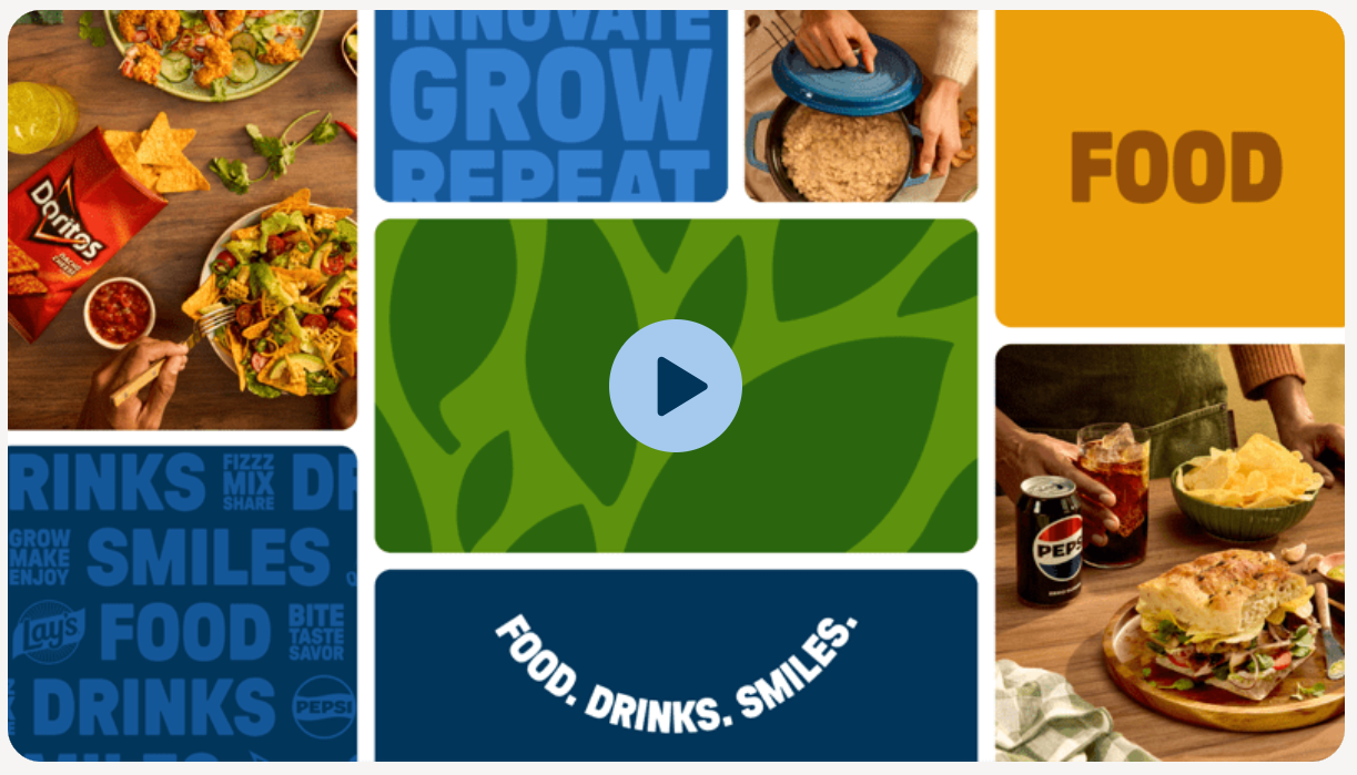
I just… don’t like the logo, or this press release.
Honestly, this is such corporate fluff for trying to justify a logo that I just think isn’t fit for purpose.
I think it looks like a logo for a nappy or baby food company.