So, when I asked my friends on my personal social media for any burning questions about Graphic Design, Visual Identity and the like, this one came in real quick:

When you start designing a logo, what's the first thing you look for? How many logos do you go through before you find the final design? How different from each other are they?
When I design a logo, what’s the first thing I look for? Now, I’m going to assume you’ve read my previous articles about the pre-production of a visual identity, so you know about how I get all the information and direction I’m working from. And now I wanna talk about how I move from that list of values, preferences and target audiences into something visual. Well, as best I can. This is kind of the hard part…
Step 1. Distillation
The first thing I do when I have all this information about my client is boil it all down to nouns and adjectives. Verbs can come to the party too, but they’re a little harder to work with than nouns and adjectives so I tend to work with those.
So, take for example the work I did for Clockwork Prism. A total rebrand, throwing out everything that they have and starting from scratch. We did our initial consultation, a nice big two hour chat where we filled out this ten page questionnaire and then I said “let me get back to you in a couple days with some thoughts”. And thus began The Distillation. I took this big, 10 page document that was basically the entire ethos, background and mission and looked through to find the patterns. The words that popped up over and over, the similar vibes and the throughlines. They talked a lot about how they are collaborative, both with their clients and other freelancers they work with, and about how they emphasise clarity and communication in their work. They also wanted their new brand to be clear they looked like a media company without looking exactly like every other media company.
And that was the start of my list. Collaboration, clarity, communication, messaging, awareness, passion. I basically got out my sketchbook and wrote down all these words on a page, and then word-clouded out into synonyms, symbols and signs that represent all of those things.
This left me with a whole page of ideas. Not, like, ideas for the specific logo, just ideas. Concepts that I need to refine and combine until we find the mark that hits just right.
Step 2. Refine
We have our big page of words. And that’s too many words. We need to slim that down. I recalled us talking about not wanting to look like every other company. So the first thing I did was cut out all of those cliche stuff. The first on the chopping block was:
Play buttons
Cameras
Apertures
Record buttons
This isn’t me eliminating those designs altogether, they just will not be clear starting points. I also went through and cut down the things that only came up a couple of times, and combined things that are similar into one big idea
So the refined ideas I had were:
Working together
Messaging & Communication
Media
And from here, we go to step 3, Combining
Step 3. Combining
After this, I start looking for ways to combine any two of these ideas, or ideally three, in a clever way. So here’s where the magic happens.
And this is also where we factor in that second question that our question-asker asked. How many logos do we go through before the final design, and how different are they?
Well, really it varies. Sometimes you knock it out of the park the first time. But that’s like a 1 in a million thing. Usually there’ll be at least three to five radically different concepts, and then we’ll explore each of those concepts another 5-ish times. So it’s anywhere between 25-50 designs.
I used to present the top three ideas to my client to allow them to choose their favourite, but in recent jobs I’ve stopped doing that and instead I only present my single best design. I do this for a few reasons:
Having done all the research, knowing my client’s needs and their audience’s needs, making an informed choice of which of the three designs is best shows I am more than just a designer, but a visual identity expert.
Giving clients multiple designs confuses them, and splits their attention between multiple ideas. Presenting one single, strong design gives them confidence in you, and in the design.
Sometimes there just isn’t a third good enough design, so I have to push myself and waste everyone’s time making a third on that might never get used
So now I just present one solid idea that I have a lot of faith in. I explain how it solves the problems they spoke about, how it encompasses their values and mission, and why I made every decision I made. I can justify every decision so they go into the next phase of the design with confidence in their new logo and in my abilities.
But behind the scenes I am frantically turning ideas into pictorial representations of them and smashing those representations at each other 30, 40, 50 times until I hit something I love
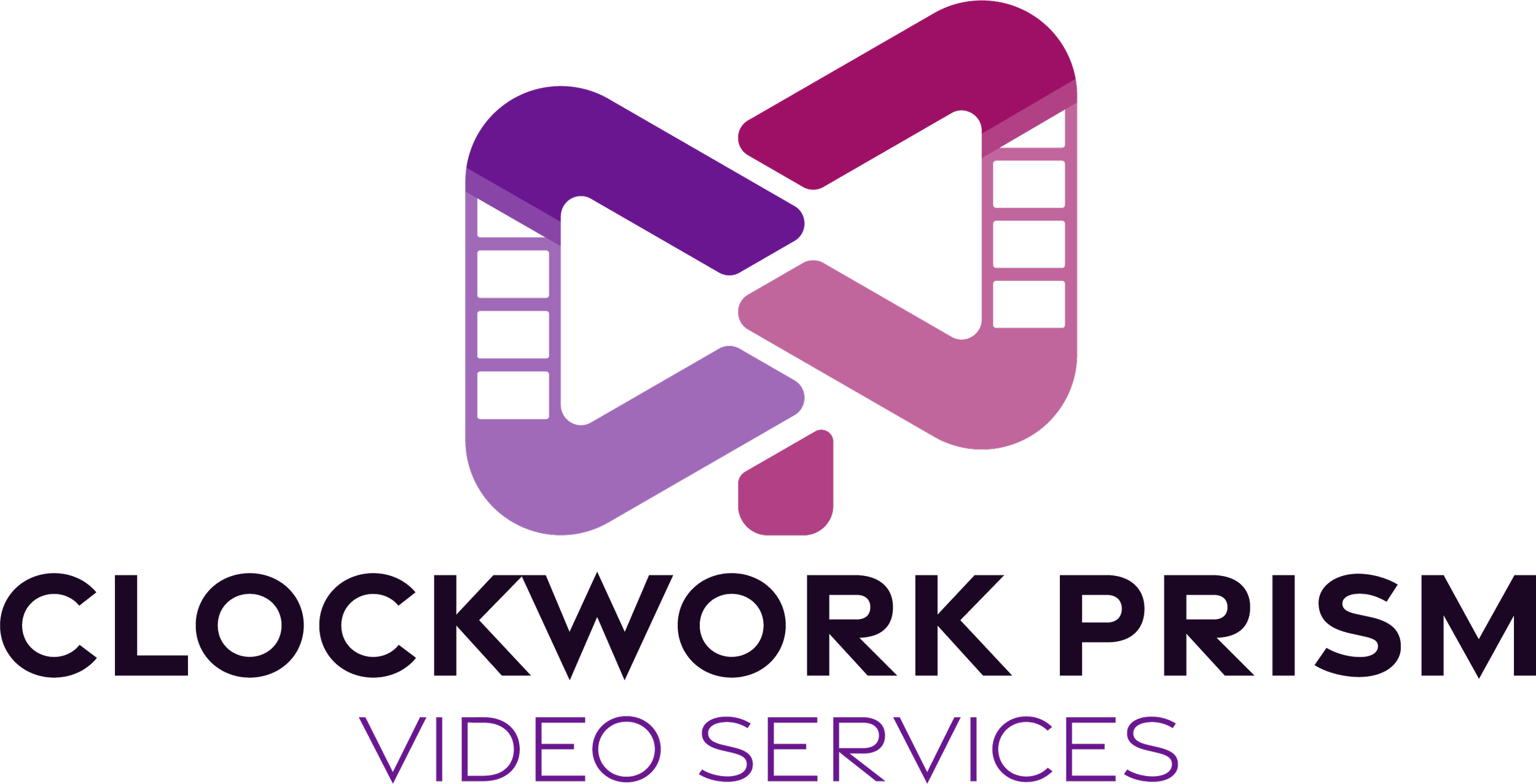
What did we end up with at Clockwork Prism? Here.
It’s, on it’s face, a monogram of CWP. The W is a little more abstract, but they’re all there.
It’s also got some of those trappings of media company in there, like an abstracted camera and a play button, without looking too specifically like either one of those. It also looks like two forms, two ideas coming together, to represent the collaborative nature of the company and it’s ethos.
I dig it. What do you think?