Creating a symbol for a bold new start in Children’s Games
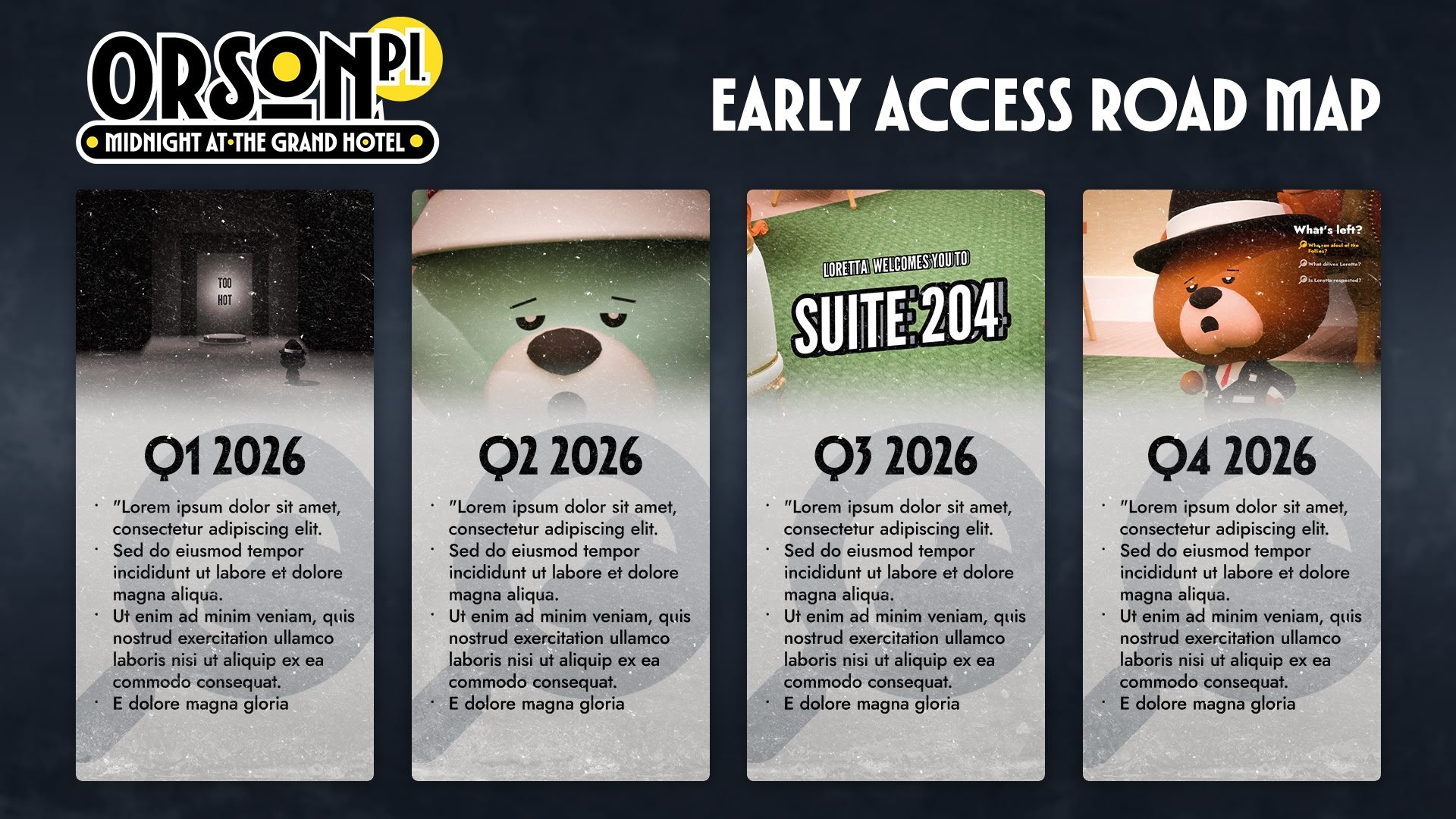
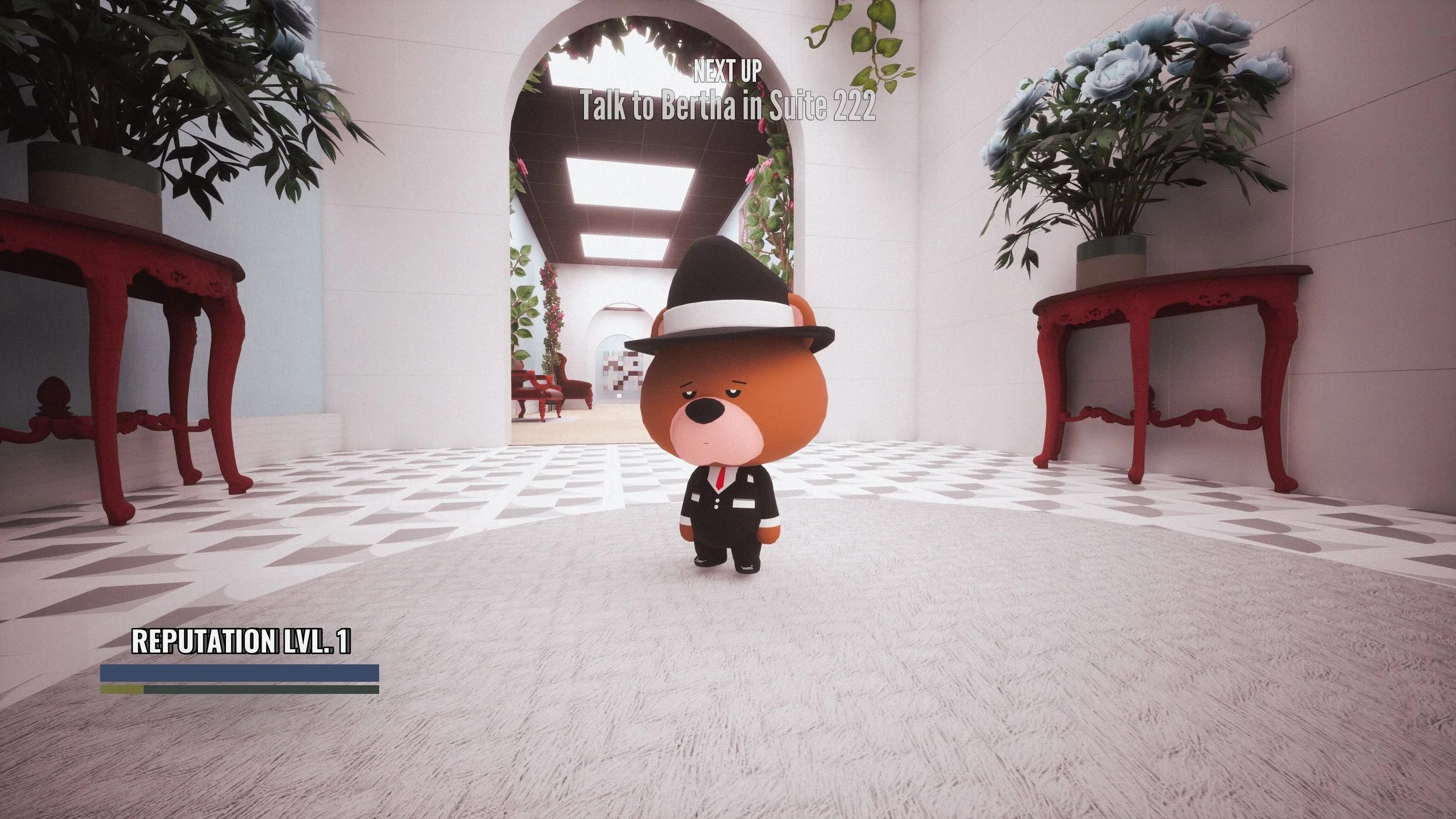
Orson, P.I. is a new series of child-friendly detective games developed by Abscure Games. They had a full logo already created in-house, but they needed to fill out the logo suite with an emblem, for use as a symbol for the first game, and the series as a whole.


Hard boiled, like a sweet
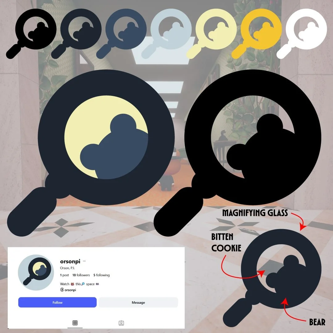
For the logo, we decided on this Magnifying glass shape, with the lens cutout to resemble both the head of the titular bear and a bitten cookie - a recurring motif in the game.
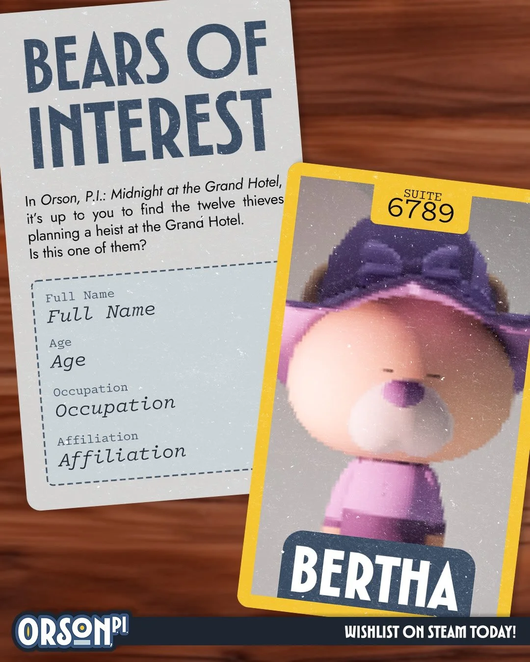
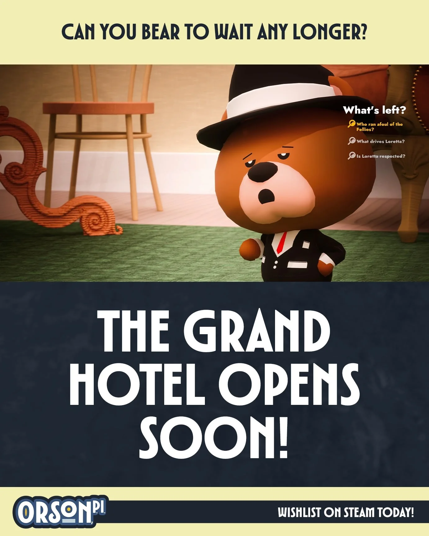
The Twitch Overlays and Promotional Material used a skeuomorphic approach, making it look like a Point of View shot of Orson at his desk. This served to bring viewers into the world of the game, telling them the setting and vibe without explicitly telling them.